Tutorial 2: Build a real service with uploads and conditional page flow
- 22 Aug 2024
- 13 Minutes to read
- Print
- DarkLight
Tutorial 2: Build a real service with uploads and conditional page flow
- Updated on 22 Aug 2024
- 13 Minutes to read
- Print
- DarkLight
Article summary
Did you find this summary helpful?
Thank you for your feedback
Welcome to Govforms Tutorial 2!
In this tutorial, we will be creating a simple digital service from scratch and exploring a few of the different UX component types and options available. We'll then be looking at how page flow in Govforms works and how to branch the user journey based on user answers.
To do this, we'll be building a service that asks the user to upload a receipt and enter some claim amounts. We'll build on this service more in subsequent tutorials.
If you haven't completed tutorial 1, we'd recommend doing that first before progressing further.
Tutorial goals:
- Create a small digital service from scratch that uploads an image
- Learn how the default page flow works for Govforms services
- Learn how to use conditional rules to branch user journey flow based on previous user inputs
- Learn how to change some content and validation settings for your page components
Let's get started!
Task 1: Build out the bones of a new simple digital service
First, we're going to create a new service from scratch and add a few pages to it. We'll explore some of the different page types and how they affect how the service works for end users.
We'll also explore some of the different component types that can be placed onto each page.
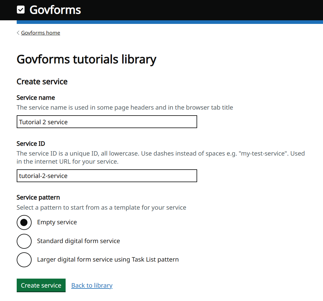
Follow the steps to create a new service:
After signing in to Govforms, select your service library and click the Create new service button. Enter a service name and ID, select Empty service and click the Create service button.
Select the new service. You'll be presented with the Service overview. Don't forget, you can always return to the Service overview using the Service home link at the top-right of every page when editing your service design and settings.
Your new service has 1 page that contains a single Content component. Let's edit that and add a few more pages.
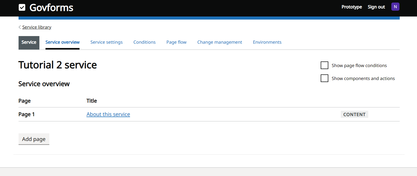
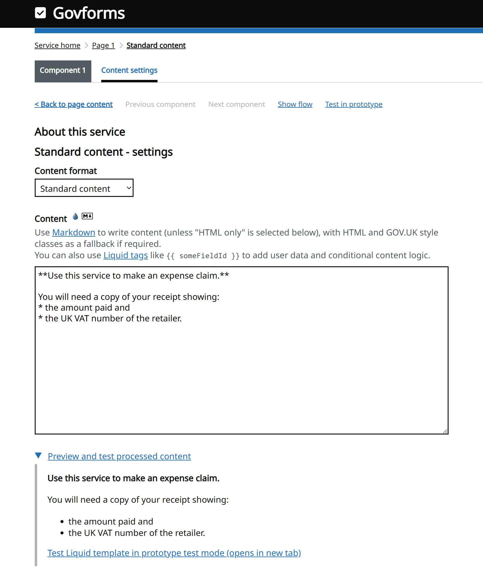
From Service overview, Click the Page 1 title to edit page 1. Click the template Latin content or the STANDARD CONTENT tag to edit the content. In the Content text box, let's enter some introduction text for our new service.
Enter the following then click the Apply button: Use this service to make an expense claim. You will need a copy of your receipt showing the amount paid and UK VAT number of the retailer.By default, you can use Markdown syntax when entering content like this. Markdown is used by digital content designers as a simple way to add rich formatting to digtital content. For example you can add an astrix (*) either side of some text to render it in bold, start a new line with one or more hash characters (#) to make the following text a heading, or start new lines with an astrix followed by a space for bullet lists. You can also insert most HTML tags and use any CSS classes from the GOV.UK Design System. You can learn more about Markdown content formatting here https://www.markdownguide.org/basic-syntax.
Go ahead and experiment with adding Markdown formatting to the Page 1 content. Click the Preview and test processed content link to expand a preview area that will show you what your Markdown content will look like to the end user in the prototype and real service. Try entering the more richly formatted example in the screenshot below:
After applying your changes, click the < Back to page content link to return to the Page 1 design view. Click the Add next page button to add a new page after page 1. We're going to make this a Question page. A question page is a GOV.UK design pattern that asks a single question in the page title and includes a single input component for the user to enter the answer. The input component is not given a label. This type of page is highly recommended in general because it provides excellent accessibility for all user types and is especially good for services used primarily by mobile users.
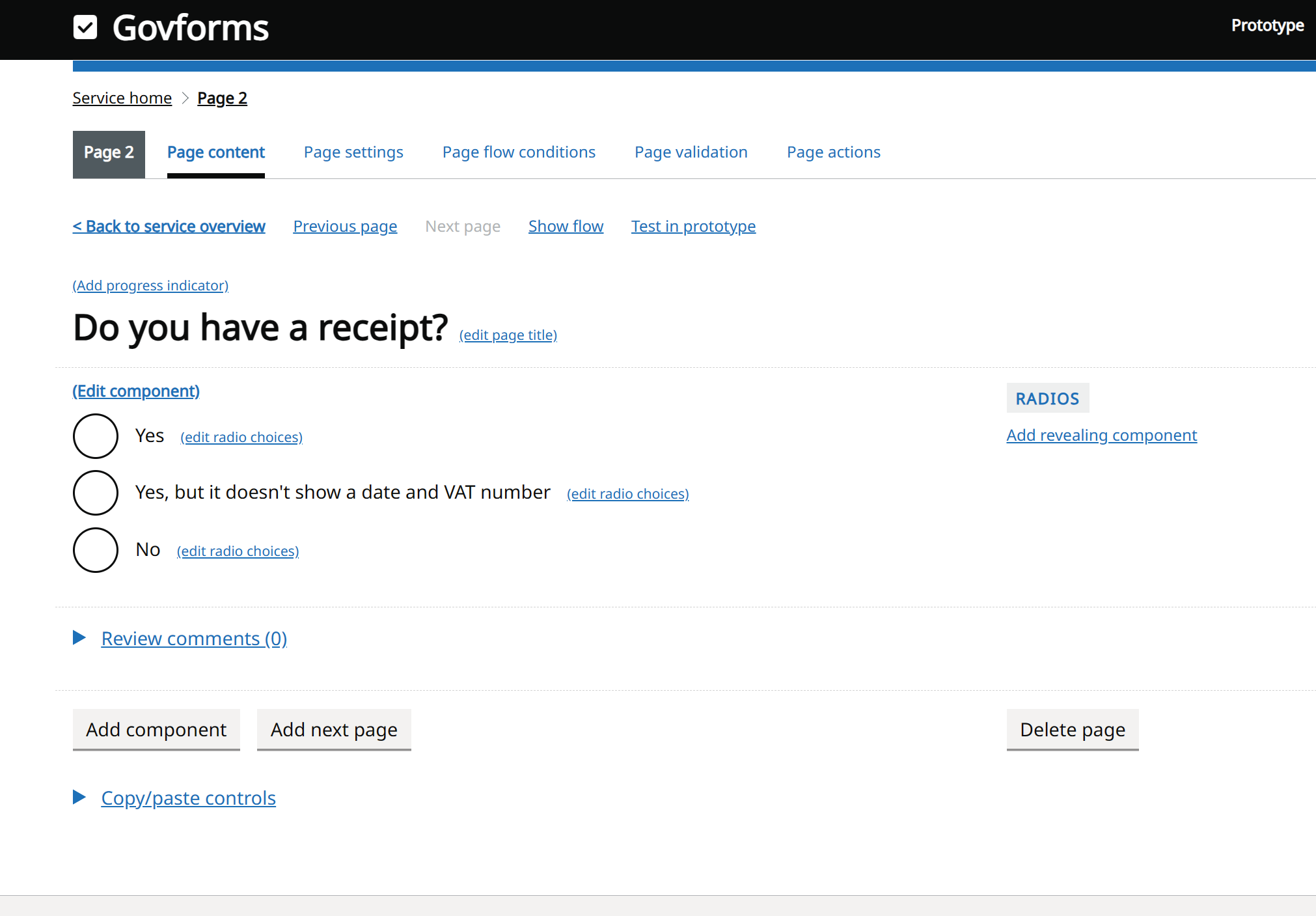
Enter Page title Do you have a receipt?. Enter Page pattern Question page with answer choice. Click the Add page button.You'll be taken to the new Page 2 design view. Because you selected Question page with answer choice as the page pattern, Govforms has added a Radios component to the page. The Radios component allows a user to select one of a list of answers. The Edit component link allows us to change component content and settings. For example if we wanted to allow the user to provide multiple answers we could change it to a Checkboxes component via Component settings, or if it was a long list of options we could change it to a Select component (drop-down list).
By default, Govforms has guessed the Radios component should have 2 choices: yes or no. Let's tweak that. Click the (edit radio choices) link (you can also get here via Edit component->Choice settings). From here, you can view and edit the choices in the radios list. Click the Add a choice button. Enter choice ID yesWithoutVAT and choice text Yes, but it doesn't show a date and VAT number. The choice text is what's shown to the user and the choice ID is something we can use with more advanced features like Liquid templates (we'll explore this in later tutorials).
Click Apply then < Back to choices. Click the Up link next to the new Choice 3 you just added. It'll swap places with the "No" choice, so your Radio list now goes Yes, Yes but it doesn't show a VAT number, No. Click Return to page content to go back to the page 2 design view.
Click Add next page. Enter Page title About your claim. Select Page pattern Multiple inputs page. Click Add page.
You'll be taken to the new Page 3, which has been created with two Text input components by default.
Click the New input field 1 label link to edit the first text input component. You'll be taken to the content settings page for this component. Along the top of the screen you'll see tabs that allow you to edit other things for the component like validation and pre-population. Let's make this text box suitable for entering a monetary amount. Change the Field ID to claimAmount. Change the Field label to Claim amount including VAT. Enter Hint text: Enter the total amount on your receipt, including VAT. Scroll down and in the Prefix box enter a £ sign. Click Apply. Go to the Format validation tab. Under Content type select Numbers only. Under Maximum decimal digits enter 2.
Edit the second component, setting the ID for this one vatAmount, with Label VAT amount, leave hint text blank and make the same changes to Prefix and Content type as you did for the previous component.
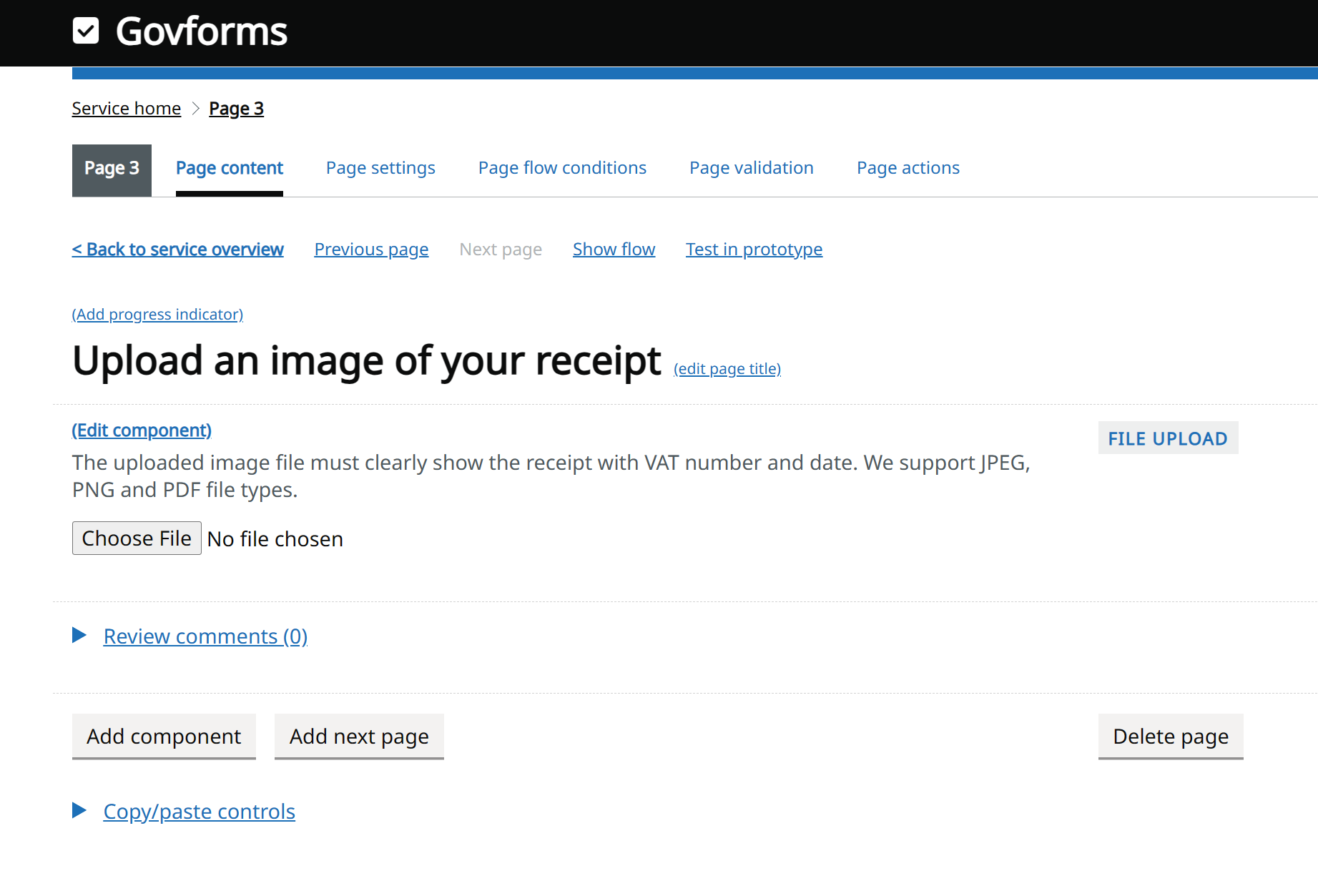
Returning to your Page 3 design view after applying changes, it should look like:Click Add next page. Enter Page title Upload an image of your receipt. Select Page pattern File upload page. Click Add page. You'll be taken to the design view for the new Page 4, which has been created with a file upload component. You can have as many file upload components on a page or across your service as you need. Govforms handles all the validation, upload functionality and file storage automatically. If you want, you can optionally select to use your own SharePoint site for uploads in Service settings but we'll stick with the defaults for now.
Click the (edit component) link or FILE UPLOAD tag next to the new file upload component to go to the component settings. Remove the label text (our page title acts as the label). Add hint text: The uploaded image file must clearly show the receipt with the VAT number and date. We support JPEG, PNG and PDF file types. Click Apply. Go to the File validation tab. Click the Add another file type so you have 4 file type input boxes and then enter jpg into the first, jpeg into the second and png into the third and pdf into the forth. This will validate the type of file uploaded by the user. Click Apply and then < Back to page content.
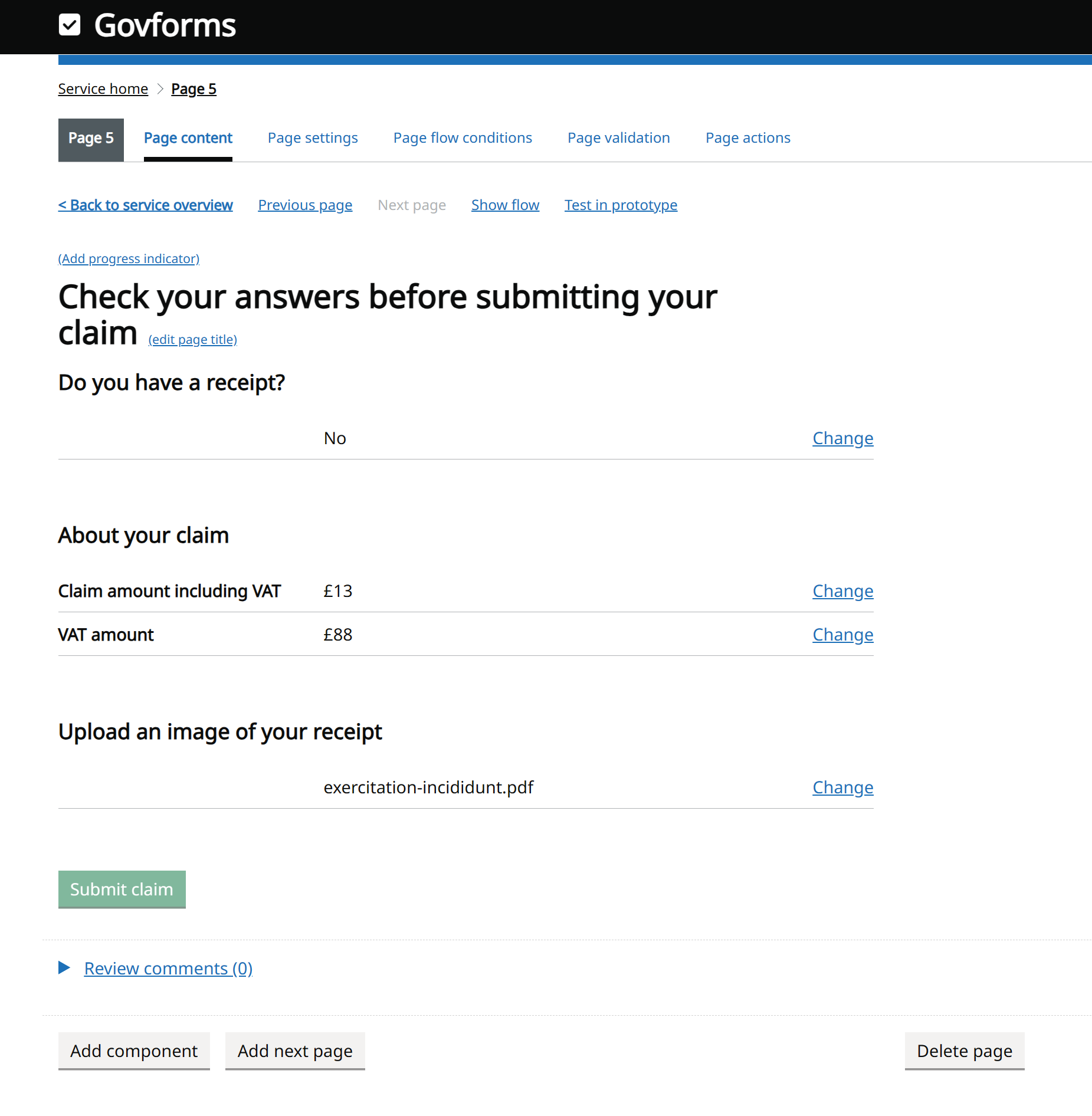
Click Add next page. Enter Page title Check your answers before submitting your claim. Select Page pattern Check your answers page. You'll be taken to your new Page 5, which follows the Check answers pattern. Go to the Page settings tab. Set Continue button text to Submit claim and press Apply then go back to the Page content tab. You don't need to do anything else here, the page will work automatically. For the design view, random text is added to the Check answers view to help you visualise what this will look like. In the prototype and real service, it'll play back what the user entered in the user journey.
Click Add next page. Enter Page title "Your claim has been submitted". Select Page pattern "Acknowledgement page". Click Add page.
You'll be taken to your new Page 6. By default, Govforms adds a banner to the Acknowledgement page and some template content. Click the (Edit content) link above the template What happens next content, change the content under the ## What happens next title so it reads:
## What happens next
Your claim will be reviewed and we may email you if any clarifications are required.
Repayments are issued within 14 days of approval.
Click Apply and < Back to page content.
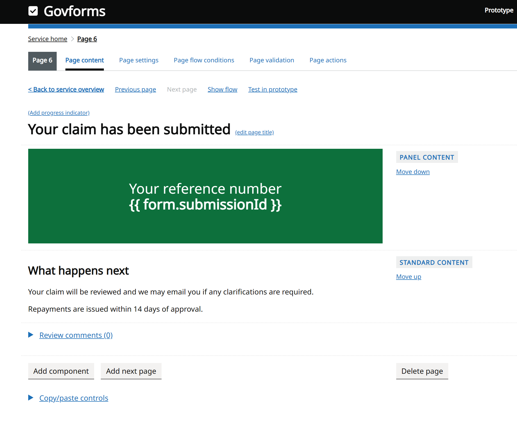


Acknowledgement pages
The Acknowldegement page pattern is very important. Acknowledgement pages terminate the user journey and prevent the user from going back and making subsequent changes to anything they entered. If your service expects to capture information from the user and submit it somewhere, then you'll want to end it with an Acknowledgement page.
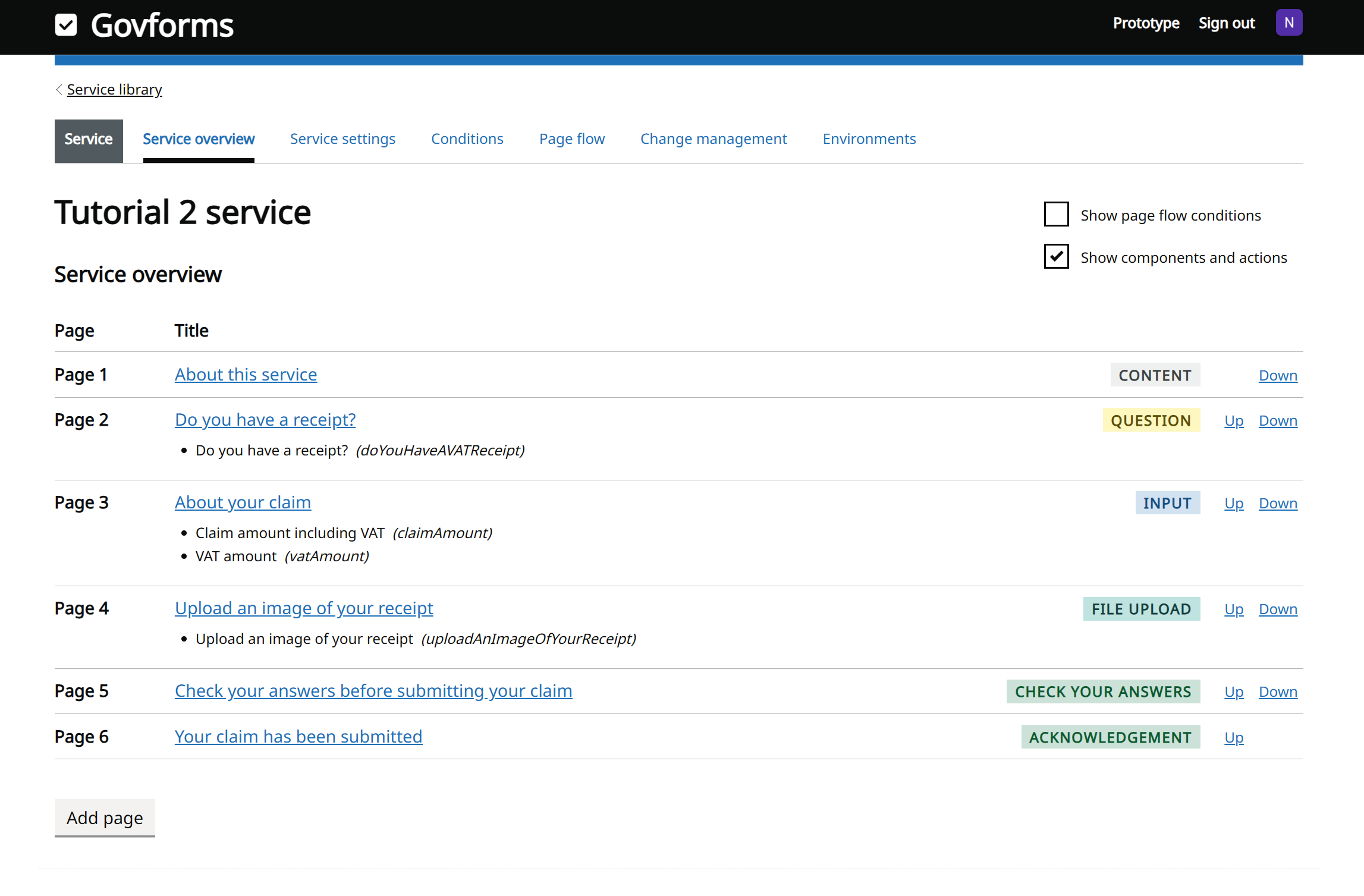
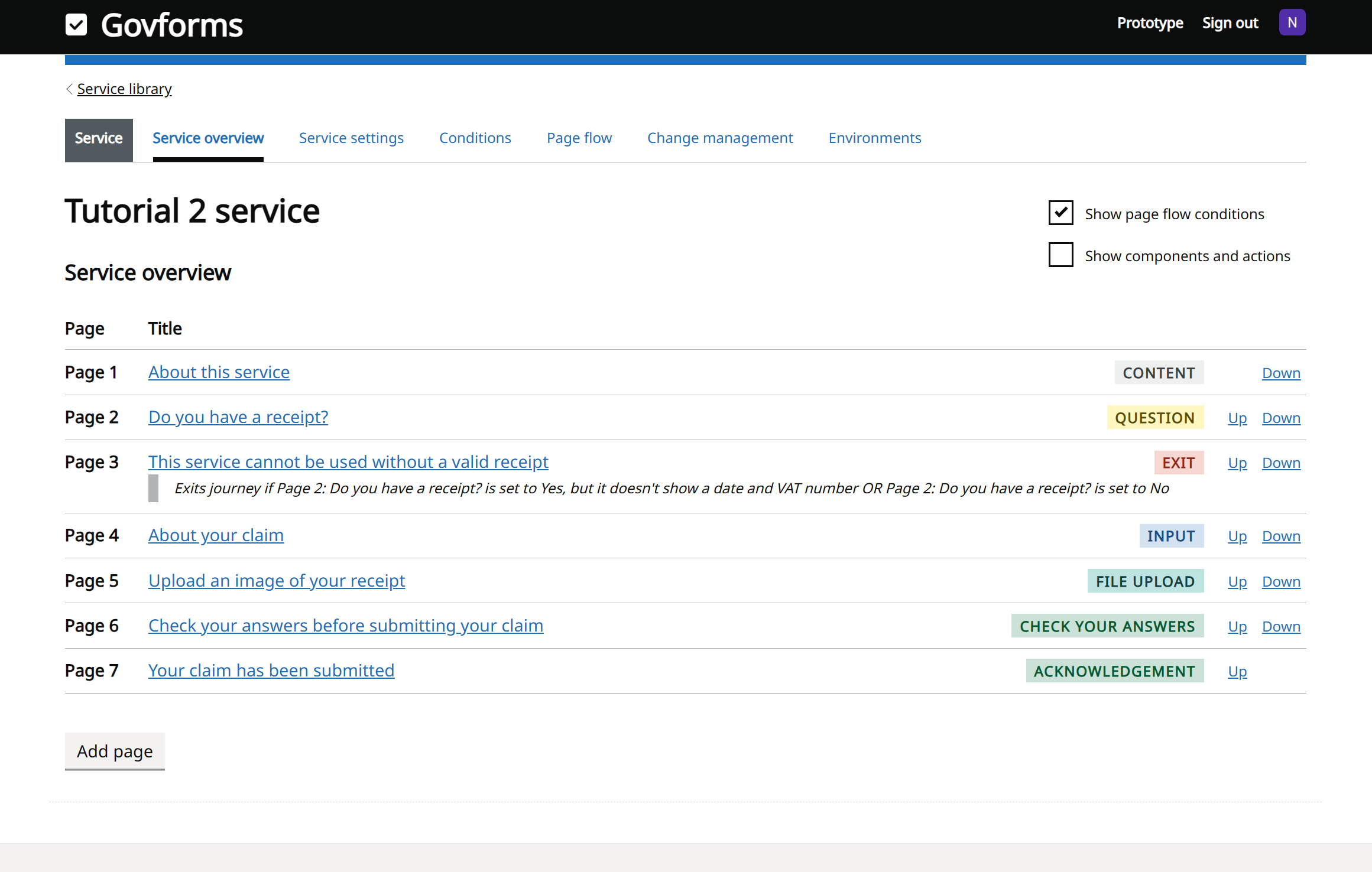
- Return to Service home. Check the Show components and actions checkbox at the top right of the screen. This will show you all the components you've added under each page with links that you can click on to easliy navigate to the settings page for any of your components. Your service should look like the following:

We've now got most the pages we need for our new service. Go ahead and click the Prototype link in the title bar to try out your service prototype as an end-user. Try out entering some invalid data, like letters in the claim amount boxes for example. Note though that in the Prototype, we're not actually uploading files or checking their type, so we'll need to run the real service in the Govforms QA environment to test file uploads properly.
Task 2: Add an exit page with a page flow condition
Now you've created the bones of your new service, let's introduce an exit page. Exit pages are used to screen out users that do not meet the criteria required to continue. In the case of our service, that means users that don't have a valid receipt.
- From the Service overview page, click the Add page button. Enter Page title This service cannot be used without a valid receipt. Under Page pattern select Exit page. Under Add at position select After page 2: Do you have a receipt?. Click Add page. If you'd like, go ahead and update the template content that's been added to this page to something more appropriate.
Exit pages
The Exit page pattern creates a page in your service that does not have a Continue button, meaning users cannot progress further in their journey. They can still go back to change previous answers. You can turn any page into an Exit page by going to the Page flow conditions tab and ticking the Exit page checkbox
2. As things stand, all users will go from Page 2 to your new Page 3 exit page. Instead, we want only those users that selected either "No", or "Yes, but it doesn't show a date and VAT number" on the previous page to be taken to the exit page.
From Page 3 desgin view, go to the Page flow conditions tab. From here, you can directly add simple page flow conditions to the page, or select any previously created more complex conditions. Govforms provides a number of ways of creating Conditions. In Govforms, a Condition provides rules that at any point during a user's journey through your service will evaluate to either "true" or "false".
Let's use the simplest way to create basic conditional rules. Under Quick add simple page flow condition, select Yes, but it doesn't show a date and VAT number and click Add condition. Next select No, and click Add condition again. You have now attached 2 page flow conditions to this page. By default though, both must be true in order for flow to progress to the page. We want users to reach this page if either of these options are selected, not both. To address this, under Method for joining multiple conditions, select OR and click Apply.

The 3 ways of creating conditional rules
In this tutorial, we used the Quick add simple page flow condition option, which is the simplest way of creating flow rules. For more complicated needs, Govforms also has a rules editor for creating custom named conditions, and even lets you provide Liquid templates to express rules that require programmatic steps or mathematical calculations. To access this functionality, you would click on the View, add or edit conditions link or go to Service overview -> Conditions tab, but let's stick with what we have for now.
Creating named conditional rules can be very powerful for larger, more complex services. You can create the conditional ruleset once, give it a sensible name and then select it as a page flow condition in all the pages that you want to be conditional on that rule. If you then need to change the ruleset you've used throughout your service, you only need to do it in one place.
Conditional rules aren't just for page flow conditions. You can also use them to validate user input (via the Conditional validation tab under Component settings), and for more complex needs you can check them from within Liquid templates used for things like API payload mapping.
Click < Back to service overview or Service home, and then tick the Show page flow conditions checkbox on the top-right of the screen. This will show all the page flow conditions attached to each page in your service. You will see that our Page 3 is shown with an Exits journey if... link below it, describing the rules you selected. You can click this link to return to the Page flow conditions tab for this page if you need to make changes later.
Click the Prototype link in the header bar and if asked select the Delete my details and start again option. Try answering the initial question in different ways. You should find that answering Yes allows you to progress, but answering either of the other options terminates your journey at the exit page you just created.
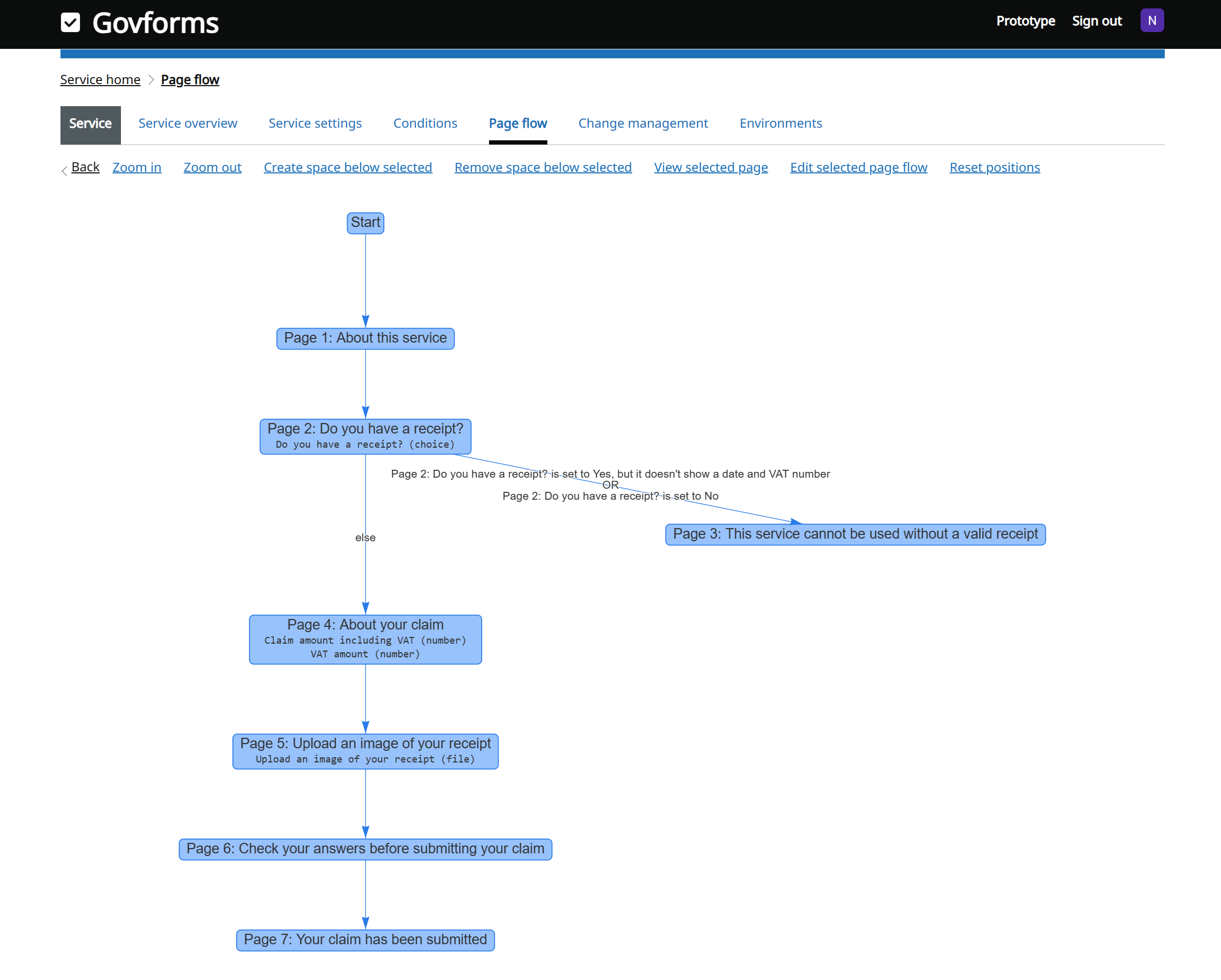
Return to the Govforms Digital Service Builder tab in your browser and from Service overview go to the Page flow tab. This shows you a visualisation of the different flows that users can follow when progressing through your service. It will only show flows that it believes are possible and can therefore be very useful for checking things look correct for services with more complicated flows. By default, it may not do a very good job of presenting the diagram. To make things clearer, you can click and drag the boxes to rearrange the diagram. From Flow view, you can also click a box and use the links to edit the page flow conditions for that page, then return to see the effect.


Conclusion
This concludes Tutorial 2. In this tutorial, we have:
- Created a new digital service from scratch including a Check answers page
- Added file upload functionality
- Added text input boxed formatted to accept monetary figures
- Configured validation for numeric text input
- Configured file type validation for uploads
- Added an exit page that is shown conditionally when users choose wrong answers
In subsequent tutorials, we'll deploy and test this service and we'll then build out more advanced functionality into it.
Was this article helpful?